


The Olympics: Design Revisited
Ready, Set, Go! At The Practice, we’re gearing up for The Olympics and have been keeping our eyes peeled for the latest design, adverts and digital offerings to celebrate the festivities. But what about vintage Olympics advertisement posters? Today, we consider our favourites and examine how these have evolved over time.
We have to begin with our very own poster from London’s last Olympics. This iconic 1948 design stood jubilantly, defying the backdrop of post-war austerity. Though for all its colour, this poster still exemplified what came to be known as the ‘Austerity Games’.

One of our favourites has to be from the 1964 Olympics, held in Tokyo. Featuring a monochromatic, bold and captivating design, this poster makes an audacious statement. These Games were also part of a digital revolution as they were the first to be internationally broadcast via satellite.

The Olympics through new eyes? The 2008 Beijing Olympics featured this poster which is radically more creative in design. Everything about this symbolises Beijing’s emphasis on the future, a fresh take on tradition, and a new era for sports. It was a powerful statement to open the 2008 Games with.

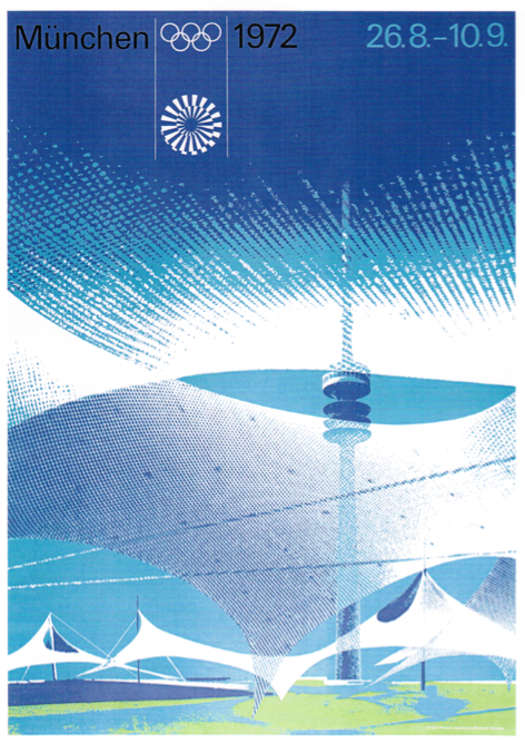
The 1972 Munich Olympic Games were marred by the tragic killing of eleven of the Israeli team members, during a hostage siege by Palestinian terrorists. Terrible events aside, this poster is graphically incredible. The design was meant to express unity, thereby featuring the Olympic tower and stadium grounds in graphic form, rather than just one specific event.
Great advertising, particulary for an historic event such as the Olympics, benefits well from drawing upon the idea of heritage and nationhood. The Athens 2004 official poster featured an olive wreath in modern design, whilst the 1996 Atlanta Games poster had a graphically edited sculpture of a traditional Greek runner as its centrepiece.
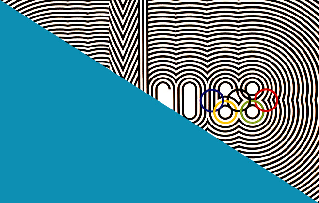
We love the Mexico City 1968 poster. The design for this arose from a collaboration of three artists: Pedro Ramirez Vazquez, architect and President of the Organising Committee for the Games, Eduardo Terrazas, and Lance Wyman who designed the ‘Mexico 68’ logo. They created the monochromatic poster to re-imagine the patterns of the native Huichole Indians. There’s certainly no denying that it captivates. Perhaps optical illusions are the future for successful marketing? Punters won’t be able to look away!

For London 2012, a host of artists including Tracey Emin and Bridget Riley have designed official posters for the Olympic and Paralympic Games. But we particularly like Sarah Morris’s use of chevrons and colour in her depiction of Big Ben, as shown below.

With improved technology and production methods, there has of course been a transformation in the resulting designs. But we’re quite surprised that even as far back as 1948, these posters imbue relatively modern graphical elements, even reminiscent of an advert you might see today.
What do you think of our picks? And are there any others you particularly admire? We’d love for you to get in touch by following and tweeting to @PracticeDigital and on Facebook.
Featured image of Mexico City’s Olympics Poster, 1968. Designed by Pedro Ramirez Vazquez, Lance Wyman and Eduardo Terrazas. Edited by The Practice